4/30/10

Design Vs Poverty


Bizhan Khodabandeh spent the past few weeks developing this illustration for a contest Design Vs. Poverty. Part of the brief discusses how poverty and war are intertwined. I spent extra time trying not to imply specific races, regions or military/militia. I am happy with the end result, although, I wish had more time to meditate on the image. You can find the image on the Design Vs. Poverty facebook group and "like it!" There are so many wonderfully executed posters in the their photo album. It is definitely worth while to look at.

Introductory workshop on flyer design


Bizhan Khodabandeh is representing There Once Was A Rebellion (T.O.W.A.R.) by hosting a flyer design workshop as part of a workshop series in conjunction with Richmond's second annual May Day Parade. The workshops will be held today and tomorrow.

I encourage people to participate in as many workshops as they want. Participants are not required to participate in the parade to attend the workshops. More info about the rest of workshops and the May Day Parade is available here.

Info about our workshop
Title: Introduction To DIY Flyer Design
Description: The first job of flyer design is to retain an audience’s attention. It is arguable that the average person spends 11 seconds deciding whether or not they want to ignore a flyer – when in passing. There are several design tools available to aid one in acquiring the attention of your audience. This workshop will go over several of these rules and provide a mini exercise to practice composition.

This workshop assumes that people have access to a word processor, a printer or copier, a pair of scissors or exacto knife, paper and glue. Materials will be provided.


Facilitator: Bizhan Khodabandeh

Short bio: Bizhan Khodabandeh is a visual communicator who moves freely across the professional boundaries as a designer, illustrator, artist and activist. His works vary from small graphic art projects to major public campaigns such as the internationally recognized, “I Dream of a Richmond . . .” project. Khodabandeh is particularly fascinated by how art and design can be a catalyst for social change.

Website: www.thereoncewasarebellion.org

Suggested Material for Reading:
“DIY Design” by Ellen Lupton, “Typographic Design” by Rob Carter, Philip Meggs and Ben Day, Type and Image by Philip Meggs

4/27/10

ARGS Student Work

Appomattox Regional Governor's School is having it's annual Spring Visual Arts Gala.

Opening Reception
Friday For The Arts, May 14th 6-9pm.

At The Petersburg Area Art League

7 E. Old Street
Petersburg, VA 23803
804.861.4611

Opening Hours
Tues-Fri Noon-6PM
Sat 10AM-4PM


Below are Illustrator portraits created by a selection of my students as an exercise in the pen tool and clipping masks. This work will be exhibited at the exhibition.

By Jake Dorsey


By Henry Schick


By Lia Bayne


By Holly King


By Ben Copolillo


By Alex Kolb


Below are a selection of information graphics developed from data gathered by students about their day. These images are also intended to be exhibited at the exhibition.

By John-Charles Holmes


By Fasendria Mungin


By Kevin Zweerink


By Boon Snavely


By Jimmy Cloutier

This years May Day Parade bandanna.


This year's May Day bandanna was designed by Bizhan Khodabandeh and references the May Day Parade poster design seen at the end of this post. The theme of this year's parade is the sabo-cat, a symbol of wild cat strikes, and threat to the "bosses." More info about the sabo-cat - as well as a sabo-cat poster designed by Bizhan Khodabandeh - can be found at maydayrva.org.


Above is a detail of the bandanna. The patterning is a reference to M C Escher's work. A repeated geometric pattern of a cat alternates between black and white. This was a particularly difficult image to create - more difficult than the cat and cat-worker illustrations seen on the poster.


Above is an image of the bandanna while it is being worn. The cat mouth becomes part of the wearer and a direct metaphor that comments on the sabo-cat as a device to amplify a worker's voice.


Above is the original poster design by Bizhan Khodabandeh for May Day.

4/23/10

Repressed V: Free To Speak, Exhibition Opening!

I co-curate this annual socially conscious art exhibition. More info below.


Poster design by Bizhan Khodabandeh

Free
7PM First Friday, May 7th
Opening Reception and Art Exhibition

At Gallery5

200 W. Marshall St
Richmond, VA 23220
www.gallery5arts.org
804.644.0005

Perfomances By
(During the Opening)
Sundials
New Rock Church of Fire
Drunk Tigers
DJ Whitine

Exhibition Closes
Friday, May 28th

About

What makes statement driven art so emotionally powerful? It being witness to a piece of work that creates a bond between you, the viewer and the creator of the piece. A bond that can change the direction of thought and purpose. A successfully executed statement driven piece can be the catalyst that inspires the average person into an active agent for change. Art exists in societies to create shared dialogues and experiences. No matter the medium, art and artists can be the spark to establishing a commonality, to allow us to empathize with each other and encourage altruistic pursuits for the greater good.


Artists In Our
Main Gallery

Heidi Blackwood
Kit Boyce
Daniel Clarke
Chris Crisis
Assil Diab
Nathan Haenlein
Matthew Hawthorne
Meta Newhouse
Elizabeth Peters
Jameson Price
Katherine Pryor
Katie Rusch
Joe Scorsone
Pravin Sevak
Margot Splane
Cody Whitby

Artists In The
Lucent Phoenix

(Our Resource Center)
Karolina Bassi
Sean P. Castor
William L. Coleman
Marleigh A. Culver
Bekky Diniega
Anna M. George
Christine E. Gilboy
Tammy Huang
Rachel Kim
Evan M. Leggett
Corinne A. Murphy
Sarah K. Nelowet
Hunter Nye
Stewart A. Penson
Sarah E. Sheehan
James M. Steentofte
Zenzile X. Sky Lark


In GallowLilys
Nitty-Gritty
by Lova Revolutionary
the art & craft
of Jodie Haffa

4/16/10

Progress On My Students' Imaging II Assignment

Below are photos of screen-printed posters by some of my students. I took the photos on my iPhone. I might post more in the future. All posters will be exhibited at Gallery5 this coming First Friday as part of Repressed V: Free To Speak.

Not all of the students are screen-printing. Some have decided to utilized stenciling as a method of reproduction.

The assignment was to essentially pick a topic you feel as though is important to educate people about and then realize it using hand executed printing techniques - of course it is more complex than that.

Each image has the name and topic written below. As always, click to enlarge.


Rachel Kim - Decline Of The Tiger Population

Rachel used a connect-the-dots pattern to encourage audience participation in realizing the illustration of the tiger and metaphorically bringing it back into our visual landscape.


Zenzile SkyLark - Decline Of The Red Panda Population

Zenzile utilized the WWF logo to reinforce the idea that the "Red Panda" is being overshadowed by the Giant Panda even though it is in greater risk of extinction.


Tammy Huang - Animal Testing For Tear Free Shampoo

Tammy uses the popular cliche "See No Evil" once she realized a relationship between the cliche and the abusive use of primates to test tear free shampoos.


Evan Legget - Copyright Infringement In The Digital Age

Even utilizes the visual language of digital media: the three colors that make up light on a computer screen and binary code. The copyright logo begins to depreciate in value as each offset color is printed. The result is both ironic in it's reproduction as well as poignant in it's commentary.


Hunter Nye - Death Penalty

Hunter juxtaposes a grade school chair with the electric chair. Notice the apple, book and writing implement on the desk. The text allows for multiple interpretations. Is it about funding? Is it about prevention? Perhaps both?

4/15/10

Inspriration, Cool Stuff, Etc #28

One Per Family - a greener car for the masses.

Nail - a workplace safety ad that was awarded a Bronze Lion at Cannes in 2008.

The Green Patriot Project - a poster contest encouraging sustainability.

NICK WALKER - Statement about the proposed ban of the muslim veil.

Ad for the Apartheid Museum by TBWA/HUNT/LASCARIS

Game Changers - competition to design a came that "forces us to rethink our lives and our relationships."

AfriCOBRA Campaign The African Commune of Bad Relevant Artists created a campaign from short documentaries about the artists via Nola Pictures.

4/8/10

Paul Revere on a Bike?!?!

Since this illustration gave me a lot of heartache, I decided to go through some of the process work behind it. It is always positive to reflect on one's failures. It is also nice to be able to take the opportunity of not having a client, to experiment, since time restrictions are non existent.

This image originally began as a solution to the Green Patriot Poster project. The context was equating patriotism with environmental politics through posters inspired by the initiatives of 1940's propaganda.
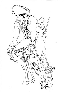

Part 1
Sketched out the image of an American Revolutionary Soldier using photo references of cyclists and Revolutionary War uniforms. I sketched out several versions of the wheels separately because ellipses are very difficult to draw by hand.

Note:Paul Revere wouldn't have been in uniform. I chose to use the uniform because it was more interesting than the basic cloak or coat Paul Revere is usually depicted as wearing. During the sketching process I decided that this would be an experiment instead of a final piece - also making the historical accuracy less important.
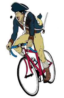


Part 2
Scanned in the inked drawing.

Matched the bike wheels up to the rest of the drawing, merged the layers and converted the combined layer to an editable one by unlocking it.

Took the editable inked drawing layer and set it's blending mode (located in the layers panel) to "multiply."

To fill in colors: created a new layer underneath the inked drawing, picked the paint bucket tool, set the paint bucket to use all layers, and began filling in the colors by clicking enclosed spaces of the inked drawing. If the space was not enclosed I had to use the paint brush on the inked drawing layer to "fake" additional line work.
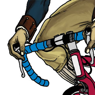


Part 3
Shading the image. Utilized a pen tablet and a basic round Photoshop brush set to 70% hardness, 48% opacity and 48% flow.

Chose darker more blue versions of the base colors and began blocking in shaded areas of the figure.

Painted back and forth between the base colors and shaded colors until they blended in their respective areas. More info on this technique can be found here.

Finished shading seen on image below.
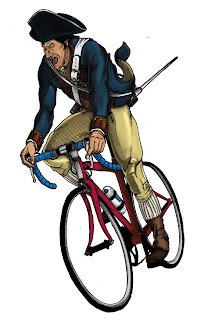


Part 4
Cleaned up various problems with the figure and added hatching using a pen tablet and Photoshop brushes.
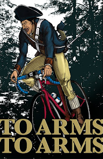


Part 5
Added a background by changing a high res photograph of a forest to 50% threshold under the drop down menu: image-> mode-> bitmap (image must first be set at image-> mode-> grayscale). 50% threshold changes anything darker than a 50% gray to black and anything lighter to white.

Also added type.
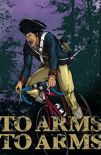


Finished Piece
Added texture to the type to erode the barrier between type and image. By sampling textures from the background the illustration is nicely sandwiched in between the two elements.

Added color to the "sky" and a spray paint texture to imply stars.

Added some further shading on the figure to imply that it is behind the type using the Photoshop burn tool.


What bothers me about this image:
The type is a little cheesy, but is maybe appropriate to the subject matter - I still can't decide. The image itself was rushed and isn't as dynamic or natural as it could have been with stronger foundations. Of course, the shading isn't up to my expectations either, but that is to be expected with a first attempt.
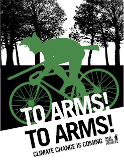


In the end I decided to go with a graphic version because it was stronger and better reflected the pre-existing system of the Green Patriot Poster project. You can register and rate this poster at GreenPatriotPosters.org.