Since this illustration gave me a lot of heartache, I decided to go through some of the process work behind it. It is always positive to reflect on one's failures. It is also nice to be able to take the opportunity of not having a client, to experiment, since time restrictions are non existent.
This image originally began as a solution to the
Green Patriot Poster project. The context was equating patriotism with environmental politics through posters inspired by the initiatives of 1940's propaganda.
Part 1
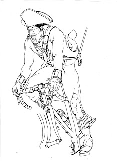
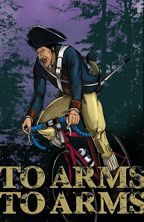
Sketched out the image of an American Revolutionary Soldier using photo references of cyclists and Revolutionary War uniforms. I sketched out several versions of the wheels separately because ellipses are very difficult to draw by hand.
Note:Paul Revere wouldn't have been in uniform. I chose to use the uniform because it was more interesting than the basic cloak or coat Paul Revere is usually depicted as wearing. During the sketching process I decided that this would be an experiment instead of a final piece - also making the historical accuracy less important.
Part 2
Scanned in the inked drawing.
Matched the bike wheels up to the rest of the drawing, merged the layers and converted the combined layer to an editable one by unlocking it.
Took the editable inked drawing layer and set it's blending mode (located in the layers panel) to "multiply."
To fill in colors: created a new layer underneath the inked drawing, picked the paint bucket tool, set the paint bucket to use all layers, and began filling in the colors by clicking enclosed spaces of the inked drawing. If the space was not enclosed I had to use the paint brush on the inked drawing layer to "fake" additional line work.
Part 3
Shading the image. Utilized a pen tablet and a basic round Photoshop brush set to 70% hardness, 48% opacity and 48% flow.
Chose darker more blue versions of the base colors and began blocking in shaded areas of the figure.
Painted back and forth between the base colors and shaded colors until they blended in their respective areas. More info on this technique can be found
here.
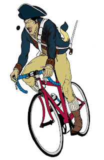
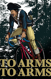
Finished shading seen on image below.
Part 4
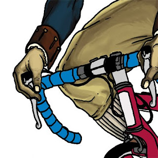
Cleaned up various problems with the figure and added hatching using a pen tablet and Photoshop brushes.
Part 5
Added a background by changing a high res photograph of a forest to 50% threshold under the drop down menu: image-> mode-> bitmap (image must first be set at image-> mode-> grayscale). 50% threshold changes anything darker than a 50% gray to black and anything lighter to white.
Also added type.
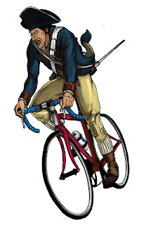
Finished Piece
Added texture to the type to erode the barrier between type and image. By sampling textures from the background the illustration is nicely sandwiched in between the two elements.
Added color to the "sky" and a spray paint texture to imply stars.
Added some further shading on the figure to imply that it is behind the type using the Photoshop burn tool.
What bothers me about this image:
The type is a little cheesy, but is maybe appropriate to the subject matter - I still can't decide. The image itself was rushed and isn't as dynamic or natural as it could have been with stronger foundations. Of course, the shading isn't up to my expectations either, but that is to be expected with a first attempt.
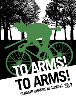
In the end I decided to go with a graphic version because it was stronger and better reflected the pre-existing system of the Green Patriot Poster project. You can register and rate this poster at
GreenPatriotPosters.org.


